16x AA font rendering using coverage masks, part III
This is part three in the series on 16x AA font rendering using coverage masks, as used in our profiler.
- In part one, we saw how to render glyphs in real-time using 16xAA, sampled at a regular grid.
- In part two, we saw how to move to a rotated grid and how the code could be optimized using a few table lookups.
- In this part (part three), we will see how we can rasterize the glyphs in real-time on Compute and CPU and how to space them correctly.
Considerations for using a glyph cache
So far, we have discussed the rendering part of the glyphs. We assumed to have a rasterized glyph containing coverage bits in a texture. In this part we are going to discuss how to produce such a texture with coverage information. In part one we discussed that we would render out a glyph for a specific size: the technique assumes a one to one ratio between texel and pixel size. We are also assuming that multiple glyphs are packed into an atlas and that the atlas serves as a glyph cache: it contains the glyphs that are actively used, and it is possible that glyphs are evicted from the cache when needed.
When it comes to rasterizing the glyphs into a texture, all kinds of choices can be made. In its most simple form, you could use an offline rendering process to render the entire set of glyphs the application will use for all its possible sizes, styles and font types. This is a valid approach and it will take away a lot complexity, but it is a very rigid approach. First of all, you would need to know in advance what fonts, characters, sizes and styles to use. In our profiler we would like to be much more flexible than that. For instance, we adapt to the currently installed system font, which could be any font. Because our product is launched globally, we want to support any character set available.
Building the glyph cache on the fly also has another advantage: a clever glyph cache that is incrementally built up will have a relatively low memory usage. One can fill a single screen only once with glyphs (provided they are not drawn on top of each other), so it does not need to take up more memory than the screen can handle. Unused characters can be evicted from the cache. The system we have designed does assume a reasonable amount of frame coherency: if every frame a lot of the characters would change in type, size or style, many glyphs in the cache would need to be regenerated. This depends greatly on the application that you are building of course. For most desktop applications (like our profiler is), the cache will be filled quickly in the first few renders and only sometimes a couple of glyphs will need to be rendered out that weren’t rasterized yet.
The process
From a high-level perspective, this is the process for rendering a string of text:
- Retrieve, tessellate and sort outline data
- Rasterize outline data
- Add rendered glyphs to glyph cache
- Draw a string of glyphs with the correct spacing/positioning
This process needs to deal a lot with coordinate spaces (space of the outline data, the texture space and the final geometry space) and needs to deal with a lot of variables in the font system like margins, offsets and something called the ‘ascent’ of a font, that we will discuss later. It forms a chain of transformations where a small mistake can lead to incorrect kerning, squashing of characters, or characters that do not line up correctly.
Retrieving and tessellating outline data
The implementation we wrote is based on Windows, so we retrieve outline and font data based on the Windows API. In part one we discussed how Windows performs grid fitting, and that it uses font hinting to alter the shape of the outlines to perform the grid fitting. When we retrieve outline data from Windows we pass a height to the Windows API. The purpose of the size is not only to retrieve those values back in that coordinate space, but also to serve as input for Windows’ hinting engine. Depending on the size, the outlines may be different, unless we disable hinting.
We first create a font using CreateFont. In Createfont we pass a height and style parameters: the weight and other attributes, like italic, underline, strikeout and so on. We want to retrieve outline data that is size-independent so that we can render glyphs on different target sizes from it. The height that we pass to CreateFont serves as an outline coordinate space that needs to be transformed to target texture space for each render. We can pick a coordinate space that we feel comfortable with.
After creating the font, we call GetGlyphOutline and pass GGO_UNHINTED to disable the hinting engine. The outlines that are retrieved will now be size-independent. GetGlyphOutline will return data in parts: some will be straight line segments, others will be in quadratic Bezier format. We need to parse the outlines and tessellate them to form only straight line segments. I have based my implementation on a version I have found on the internet by Igor Dykhta.
Tessellation is performed simply by evaluating the quadratic beziers at a regular interval and making straight line segments out of them. The amount of tessellation to perform (the length of the individual line segments) is something to play around with. Because I’m using the outlines as size-independent source data that will eventually be rendered to target size, I’m using a tessellation that is detailed enough to support any size of character I intend to use.
A quick word on stem darkening
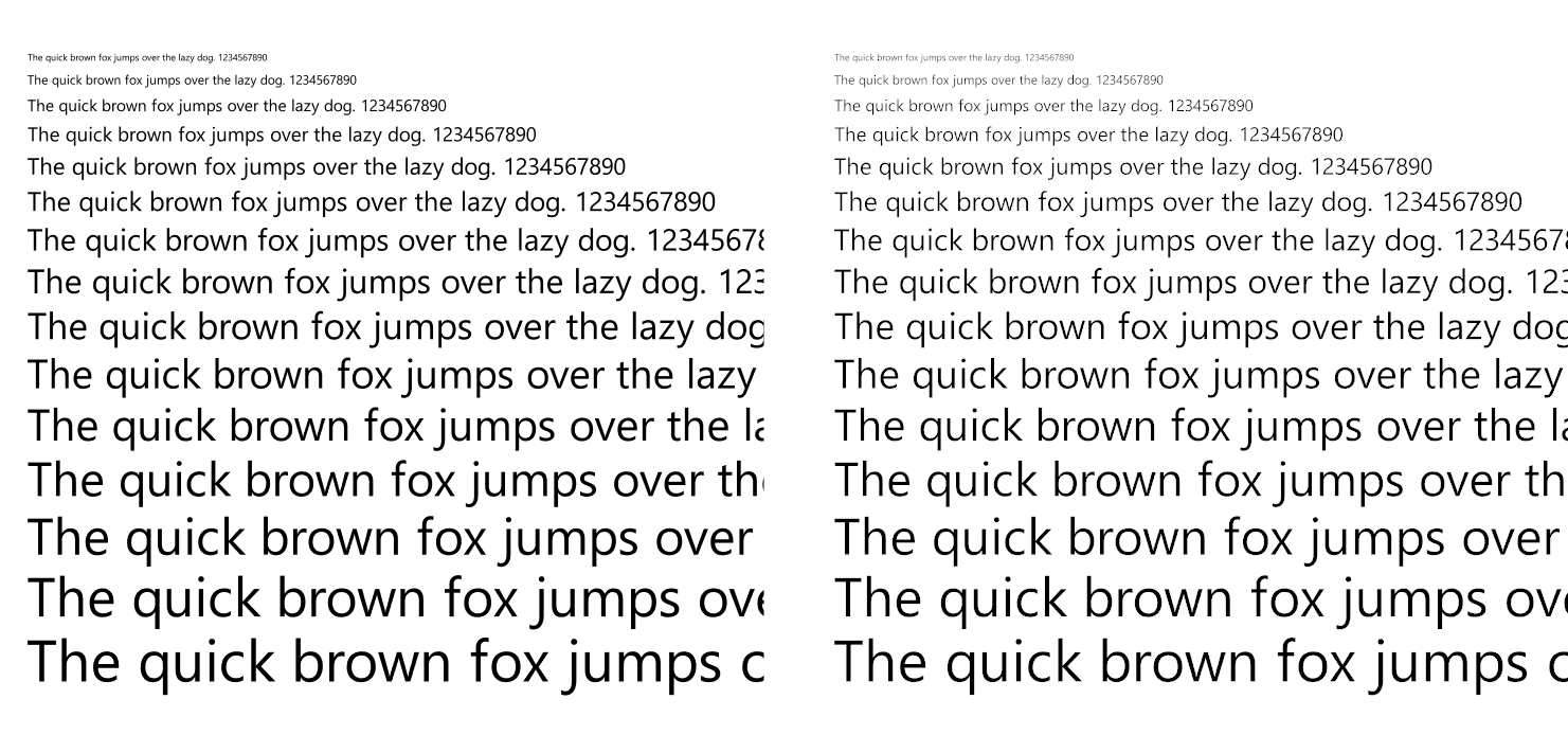
The outline data that we collected will serve as size-independent source data for our glyphs. Because we don’t intend to distort the outline data as is performed with grid fitting, we can reuse the outline data for any size. However, there is a good reason why you might want to deviate from this design. When characters become very small, parts of the glyph may be smaller than a single pixel. Because it hits only a portion of the pixel, the pixel will not be entirely black but it will tend more and more towards gray as the percentage of pixel coverage decreases. This has the effect that text gets lighter as it becomes smaller. This washed out effect is mostly noticeable when performing gamma correct rendering. Gamma correction lightens fonts since shades of gray are shifted to higher pixel values. In the following image you can see the difference between gamma-incorrect rendering on the left and gamma-correct rendering on the right:
As you can see, the smaller font sizes become consistently lighter with gamma-correct rendering. To solve this problem, ‘stem darkening’ is used by some font renderers. It basically means that text becomes a bit bolder at small font sizes to make sure they cover enough of the target pixels. Although we don’t distort fonts, adjusting the weight in such cases could improve quality on small font sizes, which is something we certainly care about. And the gamma correctness will improve the rendering as well – which is now disabled for our font rendering. The effect that this will have is that we cannot use outline data generically anymore: we need to retrieve and tessellate outline data for each rendered size. This has the added benefit that we can choose a smaller tessellation factor that matches the target render size better, the downside is that we cannot reuse the outline data for each size anymore and need to perform more outline retrieval and tessellation. This is future work for our font renderer.
Sorting the outlines
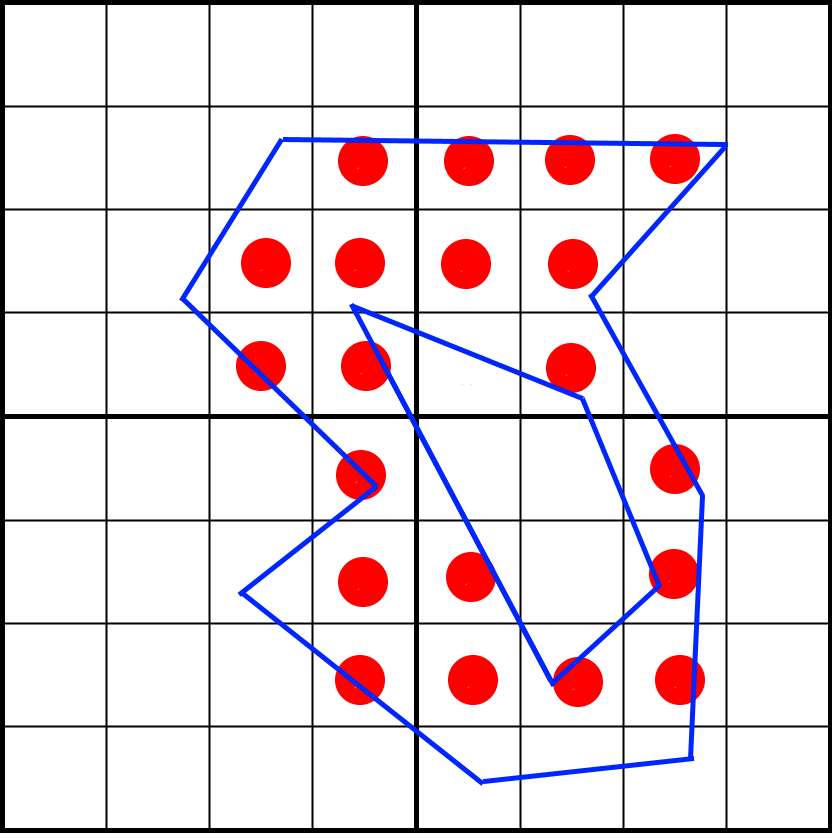
Imagine that we’d want to rasterize the following outline:
Here we see a blue polygon that we want to map to 4 pixels, while performing 4×4 sub-pixel sampling using a regular (non-rotated) grid. This means we sample on the center of each cell. A way to rasterize this is by considering each row of pixels (a scanline) and knowing what line segments intersect that scanline. Let’s take the fourth row from the top as an example:
The green lines are the lines that intersect the fourth pixel row. Traditionally, we sample each point on that row by counting how many lines are to the left of the center of the sampled point. If the number is odd, we are inside the shape. If it is even, we are outside the shape. You can see how we manage to cut out the inner section that way.
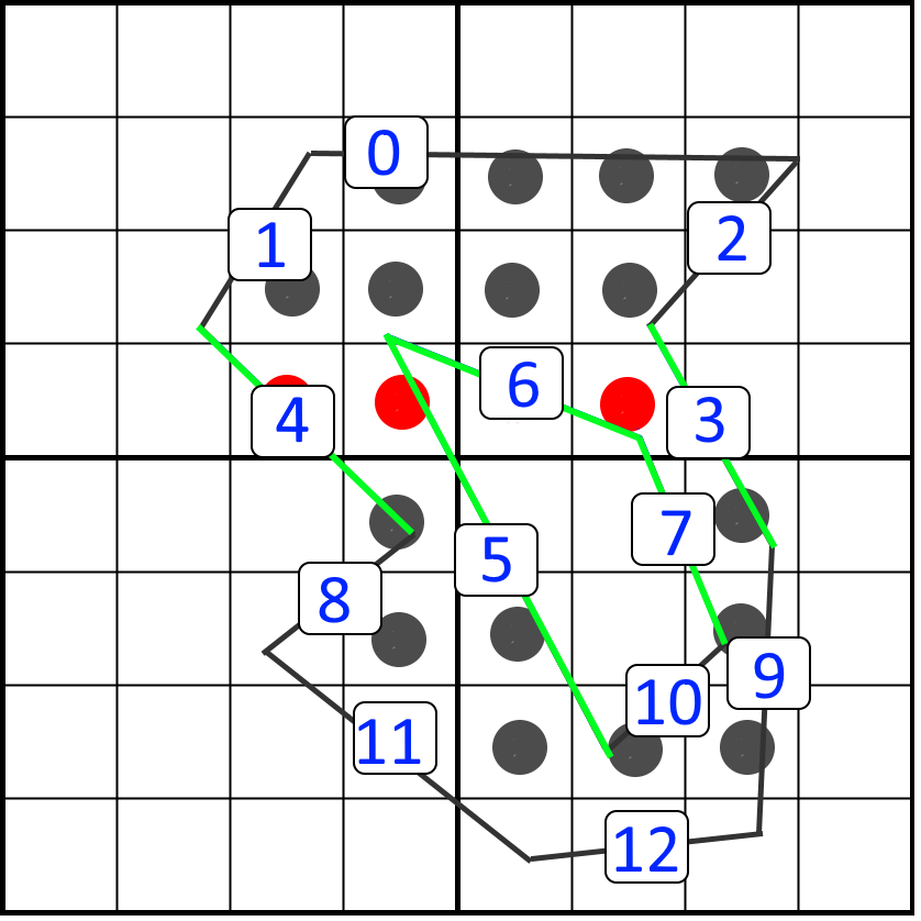
We could test each sampling point on a scanline against all line segments, but that would be quite inefficient. Instead, we can limit the amount of line segments that a scanline needs to consider. To do so we first sort the list of line segments vertically. We choose to sort on the top y position. The sorting of our polygon line segments could then look like this:
For each scanline we could start at line segment zero and loop over the sorted outlines. We would know for sure that if we encounter a line segment with a top y that is below our scanline, that none of the remaining line segments will intersect with the scanline. In our example, we would know that for the highlighted scanline (fourth scanline from the top), we would process line segments 0 to 7. We then see that line segment 8 is below our scanline, so we don’t consider the remaining line segments. The sorting is something that can be performed after the curves are tessellated.
We can improve further by not starting at index zero, but by starting at the first line segment that a scanline needs to consider. We can only calculate this index once we know the target render size of the glyph. The calculation will serve as a prepass before actual rasterization. We can loop over the scanlines and store the first index into our list where the bottom of a line segment is lower then- or equal to our scanline height. All the line segments that end before the scanline can be discarded. This calculation can be performed in a single pass over all line segments and is therefore cheap. As a result, our example scanline will only consider the minimum set that potentially intersects the scanline: line segments 3 to 7. In the following animation we use this technique to retrieve the correct lines from the sorted list for a scanline:
Rasterizing the glyph on CPU
The actual rasterization becomes fairly trivial from this point onwards. The rasterization loop looks like this:
For each scanline
	For each line segment that intersects the scanline
		Transform line to texel space
		For each texel in scanline
			Test samples in texel against line segment
The sampling in the inner loop only needs to count how many line segments are to the left of the sample. If it is odd, we are inside the shape, if it is even, we are outside the shape. For each line that is to the left of the target, we only need to flip a bit for that sample – it represents whether the line count is even (0) or odd (1). If the bit is set after all line segments are processed, the sample is within the shape, otherwise it is outside the shape. The bit flip can be performed using only an XOR operation. To test if a line segment is to the left of the sampling point, we just evaluate the line segment at the y position, and if the x position is smaller, the line is to the left.
Because the line segments share their vertices with neighboring lines, care needs to be taken to handle cases correctly where a sampling point aligns perfectly with such a vertex:
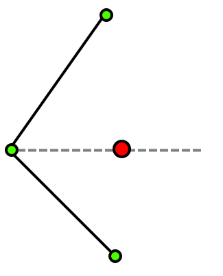
In this image you can see two lines sharing the same vertex. The line vertices are displayed in green, the sampling point is displayed in red. The sampling point has a perfect vertical alignment with a shared vertex. If we would count the number of lines to the left of it, we would count both line segments because the shared vertex point causes overlap. This causes a count of two instead of one, causing a leak in the edge of the closed shape like in the figure below:
To fix this we must make sure that one end of the line segment is inclusive, while the other is exclusive to avoid the overlap of the line segments.
Another edge case that we need to deal with are horizontal line segments. We can’t calculate dx/dy because we would divide by zero. Just picking a point on the horizontal line for reference also isn’t going to work as demonstrated in the following figure:
In this figure we see part of a glyph where two line segments are horizontal. The sampling points align exactly with the horizontal lines. We are assuming that the connected diagonal lines do not count as ‘left lines’ because their endpoints are exclusive. The numbers indicate the number of lines that are to the left of the sampling point. The red color means that they are inside the shape, gray means they are outside the shape. You can see how the closed shape leaks and is incorrect. It does not matter if you pick a different point on the horizontal line segment. The reason is that the bit flip should actually be performed twice: once for the left-most vertex and once for the right-most vertex. However, there is an easier solution: we can just ignore horizontal lines altogether. The effect of this is shown in the following image:
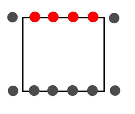
In this image we see a rectangular shape with two lines of samples that align perfectly with the top and bottom of the glyph. Imagine that we only process the vertical lines and ignore the horizontal lines. The samples on the top line will only count the vertical lines as ‘left lines’, causing a count of one when they are on the top line of the rectangle. The bottom samples, however, will not even consider the vertical lines as the bottom vertices are exclusive. So the number of lines left of these samples always remains zero. That makes these samples exclusive as well. This seems like a fair and simple solution. All we need to do is ignore any horizontal lines and we’re done.
Assuming we are ignoring horizontal lines, the sampling part then looks like this:
If line not horizontal
For each suby
	For each subx
		Evaluate x of line segment at suby
			If  subx position is greater than evaluated x
				Flip target bit
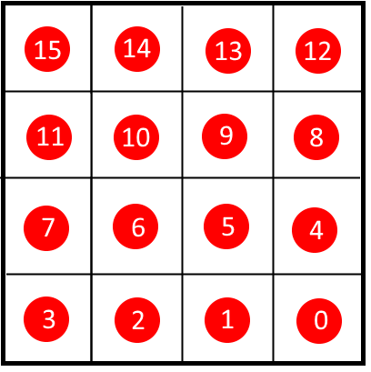
The ‘target bit’ is one of the 16 bits within a texel, so the correct bit position needs to be calculated to make sure that we store in the format that the rendering is using:
The resulting glyph needs to be packed into a texture atlas, which is something that has been done many times before and outside the scope of this article.
Rasterizing on the GPU
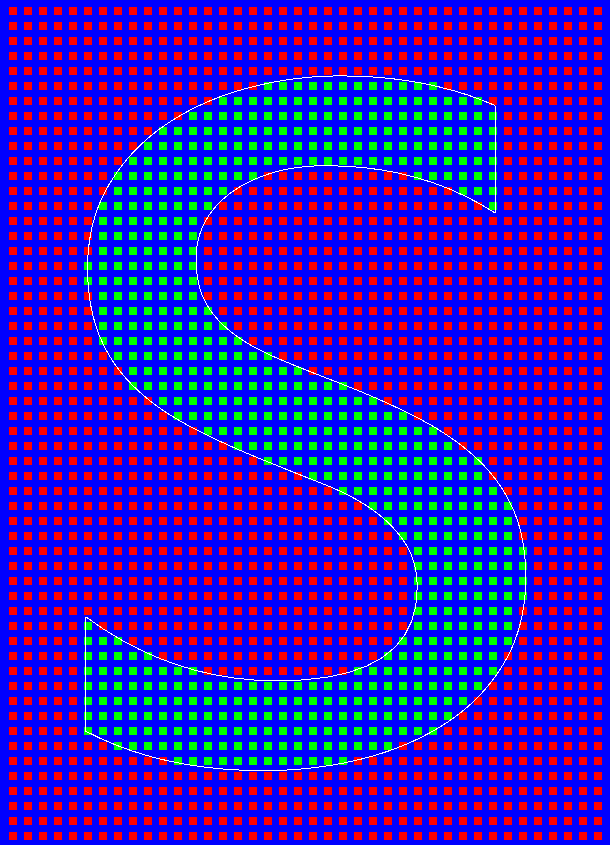
Maintaining an implementation that runs on CPU is convenient for comparison against the GPU implementation, but it can also serve as a fallback when Compute is not available. Similarly, maintaining a structure on CPU where the outlines and sampling positions are present can help a great deal in analyzing and debugging issues in font rendering. Investing in a debug environment where outlines, sampling positions and the final render can be visualized will be worth your time. For instance, here is a visualization of the sampling of the letter ‘s’ for the font ‘Segoe UI’ on a regular grid. The glyph is rasterized to 10×14 texels.
In this visualization we see the outlines and the samples that we took. We can see if all coordinate space transformations, margins around the glyph and sampling positions are correctly evaluated. Some of this data isn’t required for a final render. It is easier to maintain this in a CPU implementation than it is for a GPU implementation.
Our GPU implementation is based on OpenGL Compute, which is available on OpenGL 4.3 and above. The compute code rasterizes a single texel, making it parallel for each texel that we need to write. The compute shader needs to have the outline data available, and the glyph data (like the start indices into the sorted outline list that we precomputed). We send this data over in UBOs (Uniform Buffer Objects). The body of the code is a duplicate of the inner part of the CPU generation code, except for the texture updating part. When rasterizing on CPU we need some way to get our CPU data into the texture at the right location, but on the GPU, we can write a texture directly, which is easier and more efficient. Therefore, we also need to pass the target atlas location to the compute shader.
This is the full rasterization compute shader. The sampling is done on a rotated grid, so the sampling points are rotated to match the sampling pattern that we discussed in part two of this series.
#version 430

layout(local_size_x = 1, local_size_y = 1) in;
writeonly uniform uimage2D img_output;

struct LineSegment
{
	vec2 mP1;
	vec2 mP2;
};

layout(std140) uniform GlyphData
{
	int mTextureOffsetX;			// Target X location in atlas
	int mTextureOffsetY;			// Target Y location in atlas
	int mWidth;				// Width of glyph
	int mHeight;				// Height of glyph
	vec2 mBorderUnits;			// Amount of border to preserve
	int mScanlineStartIndices[100];		// Start into the sorted line segment array

}glyphData;

layout(std140) uniform OutlineData
{
	vec2 mSize;				// Size of glyph in units
	vec2 mMinimum;				// Minimum of glyph in units
	int mNumSortedOutlines;			// Amount of outlines
	vec2 mSortedOutlinesP1[1000];		// Top point of outlines
	vec2 mSortedOutlinesP2[1000];		// Bottom point of outlines

}outlineData;

void main()
{
	uint result = 0;

	ivec2 pixelCoords = ivec2(gl_GlobalInvocationID.xy);
	int startIndex = glyphData.mScanlineStartIndices[pixelCoords.y];

	if (startIndex != -1)
	{
		float yUnits = float(pixelCoords.y) / float(glyphData.mHeight);
		float nextYUnits = float(pixelCoords.y + 1) / float(glyphData.mHeight);

		vec2 sizeWithBorder = outlineData.mSize + glyphData.mBorderUnits * 2.0f;
		vec2 minimum = outlineData.mMinimum - glyphData.mBorderUnits;

		for (int index = startIndex; index != outlineData.mNumSortedOutlines; ++index)
		{
			LineSegment line;
			line.mP1 = (outlineData.mSortedOutlinesP1[index] - minimum) / sizeWithBorder;
			line.mP2 = (outlineData.mSortedOutlinesP2[index] - minimum) / sizeWithBorder;

			if (line.mP1.y >= nextYUnits)
				break;

			float dy = line.mP2.y - line.mP1.y;
			if (dy == 0.0)
				continue;

			float dx = line.mP2.x - line.mP1.x;
			float dx_dy = dx / dy;

			for (int subY = 0; subY != 4; ++subY)
			{
				for (int subX = 0; subX != 4; ++subX)
				{
					float subPixelYOffset = float(3 - subX) * (1.0 / 16.0) + (1.0 / 32.0) + float(subY) * 0.25f;
					float subPixelXOffset = float(subY) * (1.0 / 16.0) + (1.0 / 32.0) + float(subX) * 0.25f;

					float sampleY = yUnits + subPixelYOffset / float(glyphData.mHeight);
					if (sampleY >= line.mP1.y && sampleY < line.mP2.y)
					{
						float lineXUnits = line.mP1.x + (sampleY - line.mP1.y) * dx_dy;
						float curX = float(pixelCoords.x + subPixelXOffset) / float(glyphData.mWidth);
						if (curX > lineXUnits)
						{
							uint mask = 1 << ((3 - subX) + subY * 4);
							result ^= mask;
						}
					}
				}
			}
		}
	}

	ivec2 textureOffset = ivec2(pixelCoords.x + glyphData.mTextureOffsetX, pixelCoords.y + glyphData.mTextureOffsetY);
	imageStore(img_output, textureOffset, uvec4(result, 0, 0, 0));
}
Drawing a string of glyphs
To understand how we should position glyphs correctly, we need to invest a bit of time in the various terms associated with glyph positioning. It is quite easy to get overwhelmed by all the terms used in typography. I will try to give a quick overview of the most relevant terms.
- Point size. A measurement of the size of a font. It is an absolute physical measure, where a single point is set to ~0.353mm.
- EM size. A relative measurement of the size of a font. When a font is set to 16pt, one EM will mean 16pt. When it is two EM, the font size will be 32pt.
- Baseline. An imaginary horizontal line on which characters rest. For instance, all capital letters are placed on this line.
- Ascent/Descent. The recommended or maximum distance above and below the baseline.
- Leading. The distance between baselines on multiple rows.
- Advance width. The horizontal distance from one character to the next. This is a per-glyph variable.
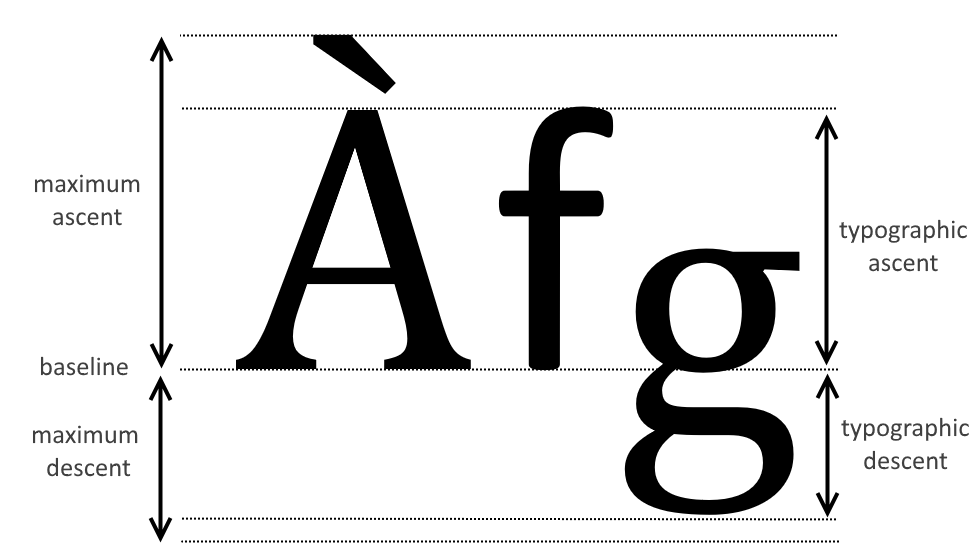
Other terms are the cap height (the distance from the baseline to the capitalized characters) and the x-height (the distance from the baseline to the lowercase characters). We do not use these and they should not be confused with more important terms. The most important ones to understand are the baseline, ascent and descent of a font. Here is an example:
Understanding most of the typography terms can be terribly confusing because of subtle differences in operating systems, most notably Mac and Windows. Even the Windows SDK has separate fields to retrieve Mac values that are present in the OS/2 metric table. Apple denotes the ascent as ‘the distance from the origin (on the baseline) to the top of the tallest glyphs in the font’. The Android OS describes it as ‘the recommended’ height above and below the baseline, separating out the properties for top/bottom of the font. The Windows documentation makes a distinction between the maximum ascent and the ‘typographic ascent’. While the maximum ascent and descent are the full range of characters, the typographic ascent and descent are typically the top of the ‘f’ and bottom of the ‘g’ character. In our experience, when using the font ‘Segoe UI’ and using the maximum ascent for the font, a lot of spacing is wasted on diacritical marks like the one in our example above, making the regular characters look very small when printed in a box. When using the typographic ascent, the height is a much more logical height, where diacritical marks may extend beyond that height. We use that height as a reference height to fit text in boxes.
The typographic ascent and descent can be retrieved in Windows using GetOutlineTextMetrics, and then retrieving the otmAscent and otmDescent members of the structure.
For the horizontal spacing, each glyph contains an advance width. This is the distance from the start of the glyph to the start of the next glyph:
In this image we see the glyph, placed in a bounding box. The spacing between the left boundary of the glyph and the glyph’s actual bounding box is also referred to as the ‘left bearing’. The right bearing is derived from the advance width of each glyph. Because characters can have overhang, the left and right bearing can be negative. On Windows these three values are also referred to as the ABC widths.
In our font renderer we normalize the glyph’s tessellated outlines according to its bounding box. We effectively strip off the boundaries and store the left bearing and advance width separately. When the glyph is rasterized, we can add a texel border of a single texel to our glyph, minimizing the space required in the texture atlas. During rendering we then need to account for that single texel in our texture mapping, and we need to make sure that the left bearing and advance width are translated to pixel space so that each glyph is positioned correctly.
And there you have it, a string of text, generated on compute, then positioned and rendered in a shader. This wraps up the work needed to write your own font renderer.
Final words
That’s it for this series on font rendering! There is plenty to keep on working for our font renderer, like ClearType and stem darkening. People suggested to try out different sampling patterns as well. Perhaps these things are something for a future episode. There is plenty more other interesting stuff we do in our profiler as well, so keep an eye out in this blog for more tech articles. Thanks for reading!


